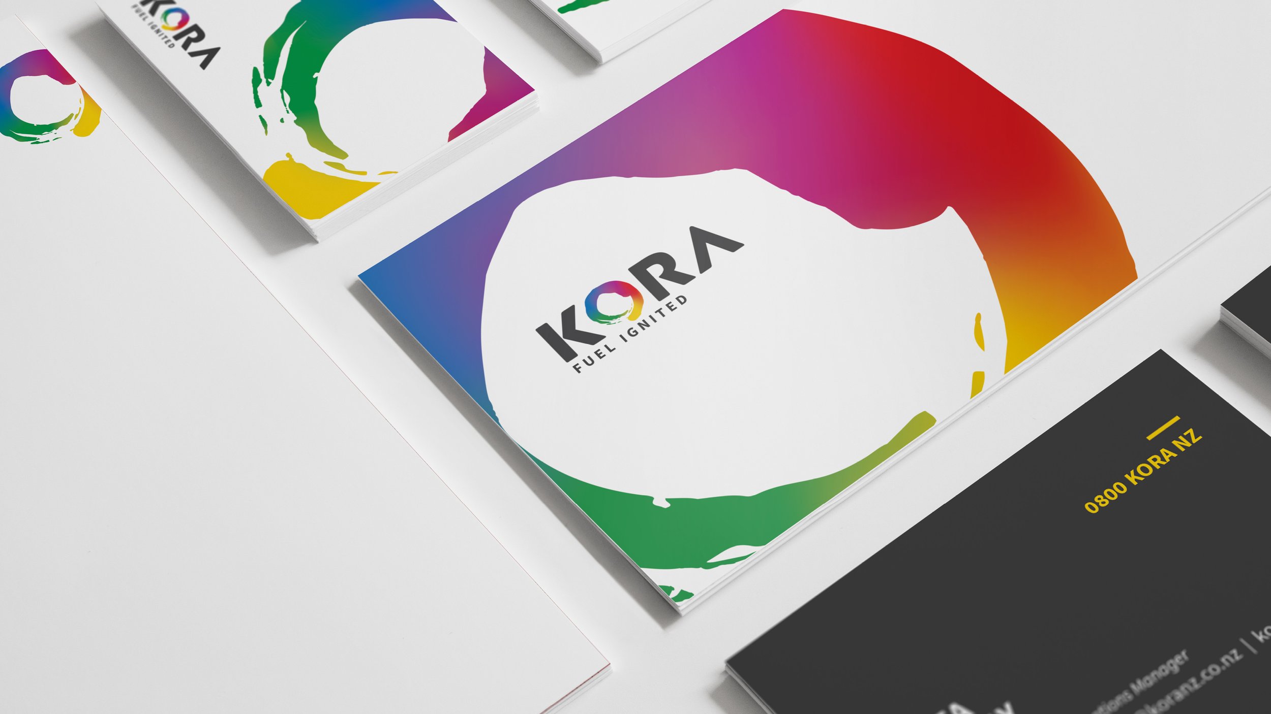
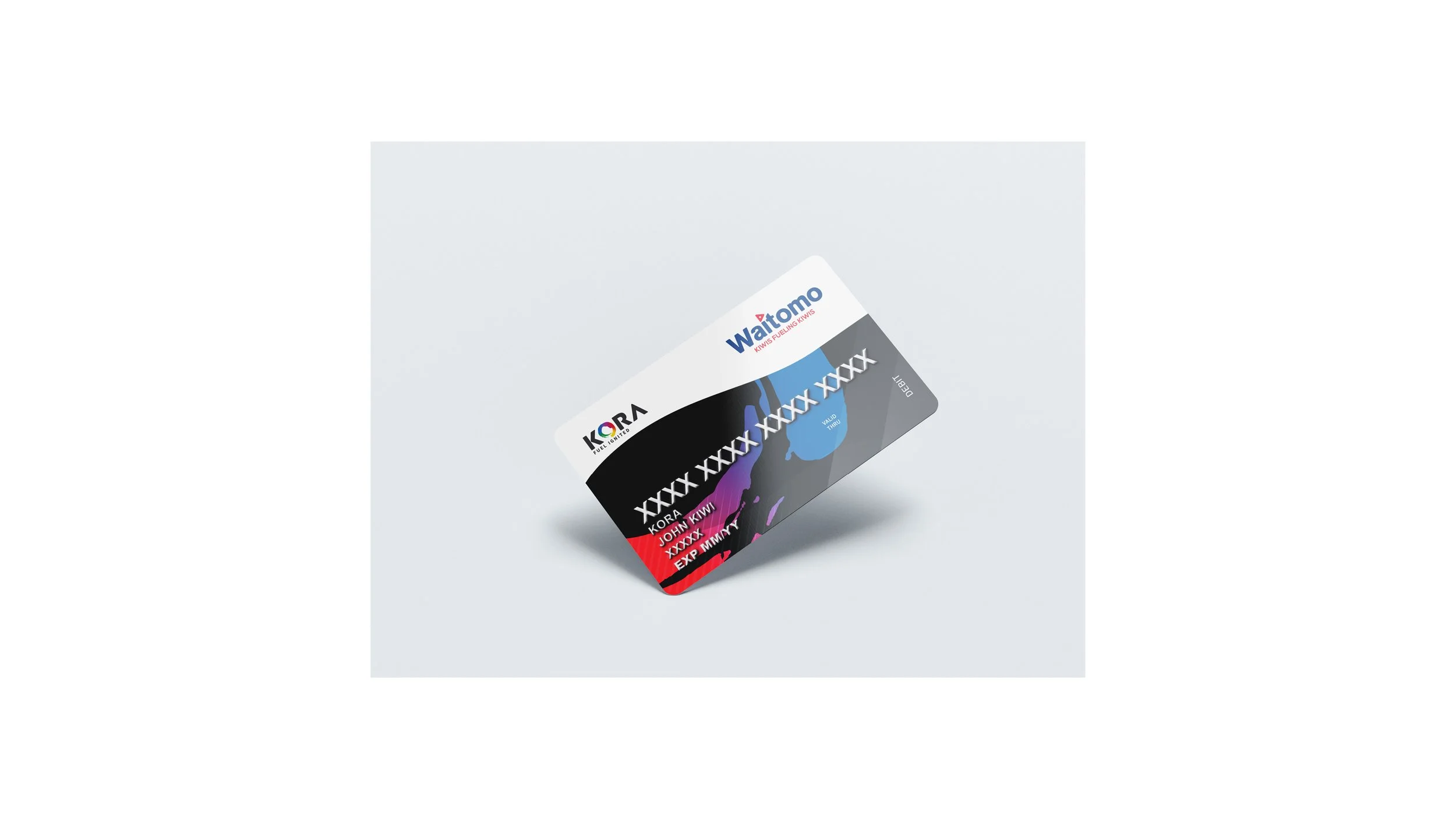
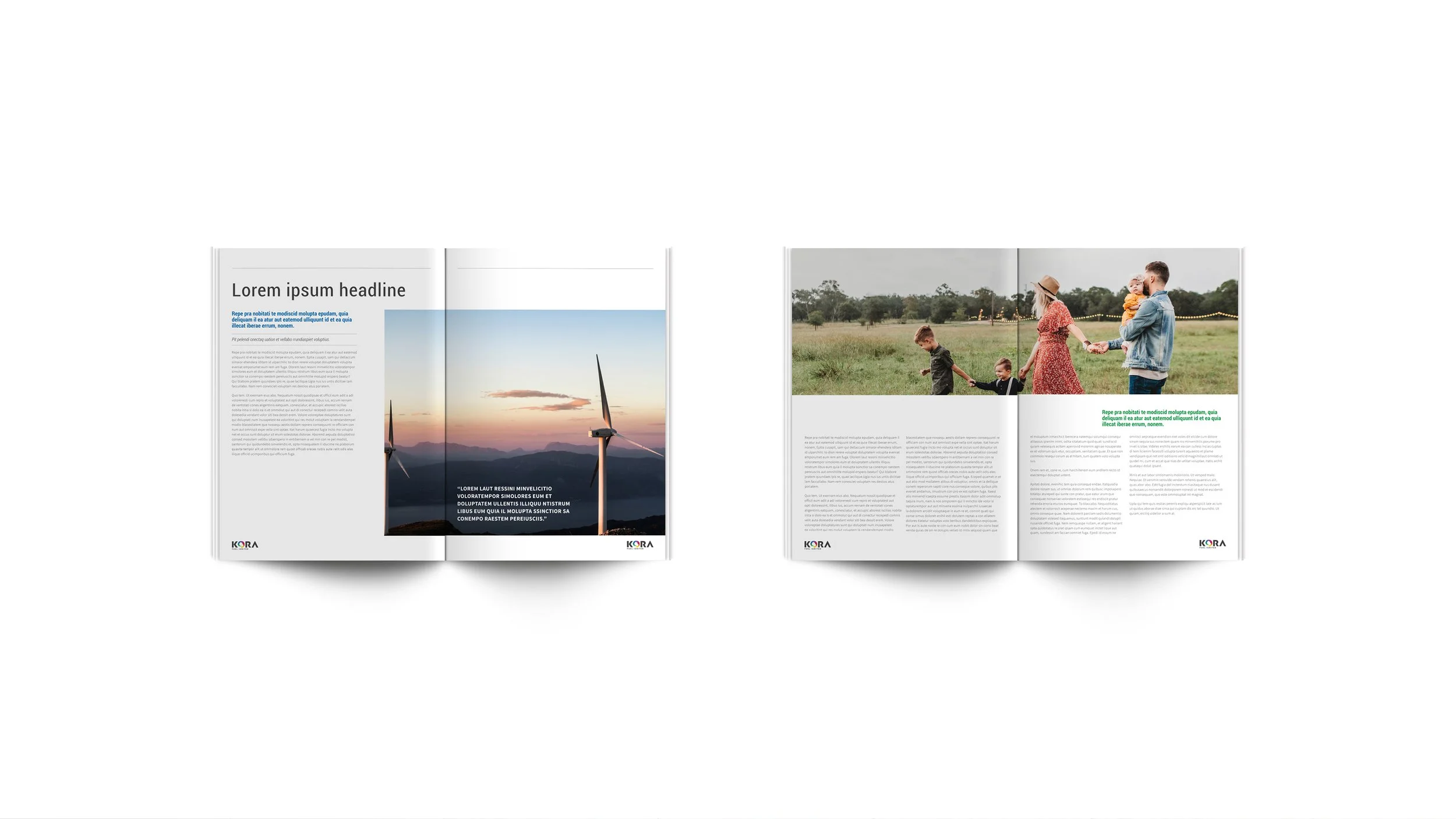
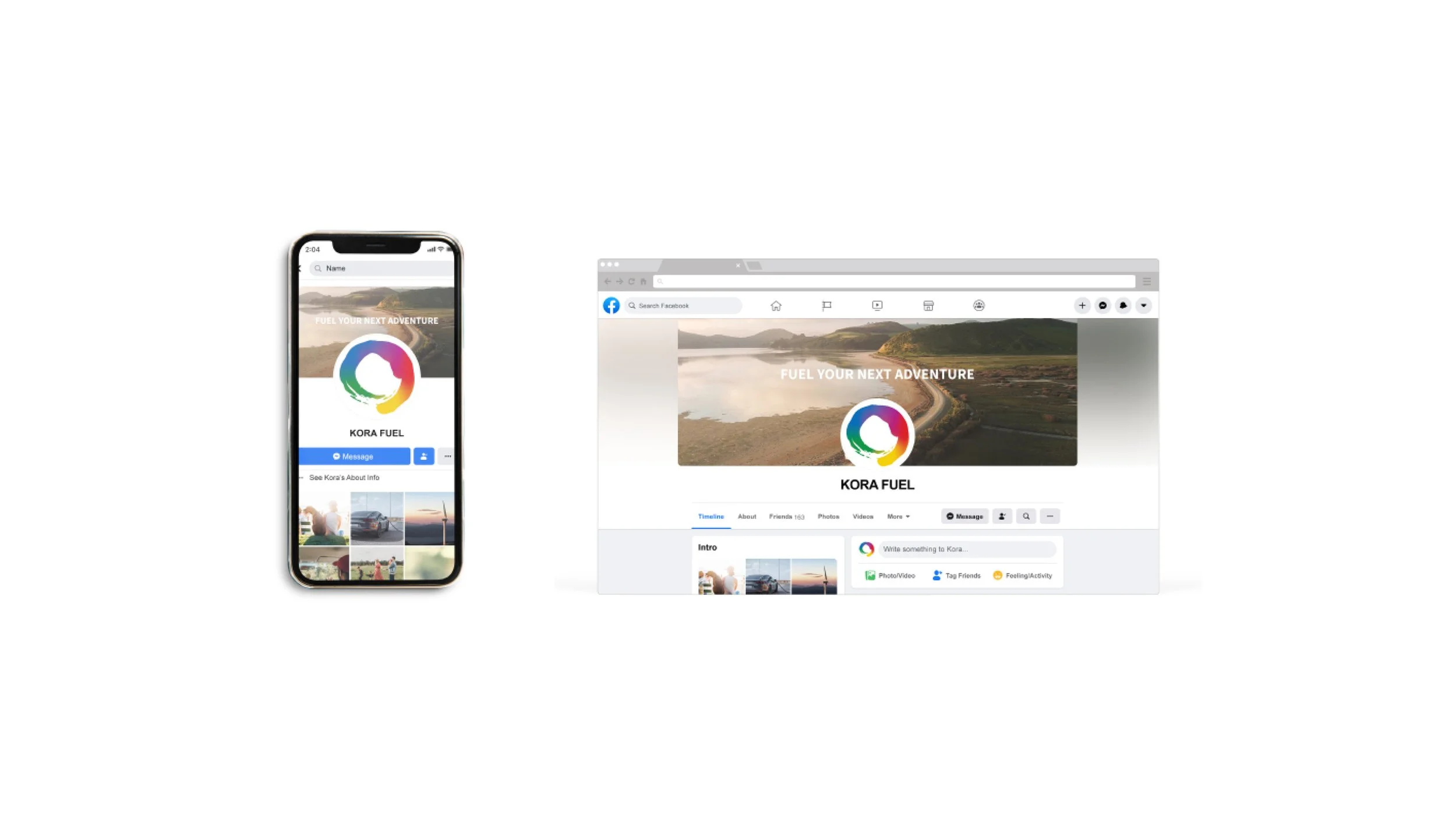
A brand identity designed to establish a confident and cohesive visual presence from the ground up. Every element was created to communicate reliability, professionalism, and flexibility across the brand.
The project began with logo development and expanded into a comprehensive branding system, including typography, a colour palette, and supporting graphic assets.
The visual identity centres around two key elements. The colour spectrum represents the diverse range of client brands the company works with, symbolising collaboration and adaptability. Complementing this, the circular brush stroke conveys energy and movement, reflecting the dynamic nature of the business while adding a distinctive visual element to the brand.